JANUARY 2022 / THE ART DIRECTION OF SEASON
Hello fellow travellers! Welcome back to our monthly blog posts, where we’ll be looking more in-depth into Season – and peek behind the curtain to see what inspires our team. We’ll be using this space to tell you more about our world, our characters, and to tell you more about the talented team of individuals working on the game.
In this month’s installment – we’re taking a look at the art direction of Season. We’ll be deconstructing the “how” and “why” we’ve made Season look the way it looks, and talk about the art and visuals that influenced us. We hope this gives you some inspiration of your own!
It has been our hope to make Season look like the concept art we originally conceived for it. Using custom shaders and other tools within the Unreal Engine, we’ve worked to make every frame of Season look like it belongs in a frame on a wall. We wanted it to feel grounded in its detail, but larger than life when looking at the bigger picture. Let’s explain what we did…

The Art Direction of Season
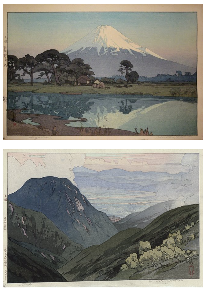
Season’s art direction is inspired by great illustrators, painters, and natural light cinematographers. It has been specially developed to suit the unique world we are building. The light rendering is somewhat flat, but the mood, tone and environments we depict still feels real. It is a minimalist approach to realism, inspired by the early Japanese woodblock print artists, as well as the poster artists, like Norman Wilkinson, from the early and mid-20th century. This simplification mindset, getting rid of rather than adding details, set the guidelines we kept in mind while developing the overall look for the game.

In Season, we are building and iterating on our own custom shaders. We don’t want our game to rely on the usual cel-shaded or “cartoon-esque” methods, despite them having their own beauty and purpose. From the beginning we wanted Season to feel familiar, but unique. The main problem we had with the traditional toon-shading methods is that it gets rid of many details, but you don’t have control over which details you get rid of. Everything gets simplified uniformingly, giving a “toy-like” feel to every asset.
We call the style we are developing for Season, ”Stylized Realism.” This style is a balance between an illustrative approach, and a more grounded approach. It is a realistic method to modeling (making sure the asset, its level of details and scale relationship with other assets feel real) and lighting, while also making sure the texture work is highly stylized, illustrative and graphic. In addition, having a smaller scope for the overall game also allows us to push the quality everywhere while keeping the handcrafted feeling intact. These are the strengths we have as an indie studio: quality over quantity.
AAA games are highly skilled at creating assets and lighting faithful to reality, while a lot of indie games have become masters at handcrafted painted texture and unique visuals. We try to combine both of these strengths, with an illustrative and painterly approach to texture paired with details and realistic assets. These strengths and weaknesses can be separated into two categories: the scale relationship between the assets and the overall lighting.
Scale Relationship
Most illustrative and artsy games have a stylistic approach to scale; a blade of grass is as big as a character’s leg, a single leaf is bigger than a head, mountains are blocky and larger than life, etc. The scale rendered in this style gives an overall fun and floaty feeling of ”big toys.” Everything has exaggerated proportions to provide unique and colorful visuals.
In the AAA style of video-game realism, the games usually portray a more accurate feeling of scale: the grass and leaves have proper height and size, and they want to convey a world that feels “real.” The scenes are made up of numerous high quality textures that go for a “wow factor,” but usually leave out any strong stylistic elements or fantastical elements.

In Season, we wanted to strike a balance between both approaches. We concentrate on having a properly scaled relationship between every asset while keeping a cohesive hierarchy and balance of details. When looking at our initial reference of Norman Wilkinson, there is a voluntary approach to simplicity; the pictures aren’t overly busy, the vegetation is merged together, focusing on its silhouette rather than trying to depict every individual leaf or blade of grass. The images are easily readable, elegant in their simplicity, and harmonized.
We do this to ground our world but also not lose the sense of whimsy. It is a world that is familiar but strange, and also maintains a strong feeling of believability. A place you could, and would want to, visit or even live in.
Lighting
The second pillar of Season art direction is the lighting.
While our game is influenced heavily by illustration and concept art, we wanted the lighting in Season to depict a certain realism in its mood. Some other artsy and illustrative games have become masters at creating fantasy worlds, playing with unusual, whimsical color combinations, depicting universes that can only live in our imagination.
In Season, we wanted to stay within the range of reality in our depiction of lighting. We were heavily influenced by contemporary plein air painters and modern cinematographers who are experts at balancing real life lighting scenarios with artistic intent. While we knew Season would be set in an imaginary world, we wanted it to feel grounded by bringing believability to its different moods and time of day.

In Season, the artists focus on how local colors are used in traditional paintings. To achieve this look, a custom shader was made for Season that focuses on using the albedo (or local colours) and shadow tint in the way that they are done in illustrations. Focusing on these two aspects results in an illusion of color and shadow that recreate the depth and texture of illustrative works.
Because everything is individually editable though, using global lighting to unify areas proved difficult. Since each object has its own shadow tint, it is hard to maintain consistency over different lighting conditions. A golden early morning, or a cool mid-day would mean each object would have to be edited to properly reflect the scenario. We wound up using PBR (physics based rendering) with our own tweaks to alleviate these issues. The happy medium between the realistic and the illustrative.
We also turned to sky lighting and sub-surface scattering to make the world of Season feel even more familiar for our players. By shifting the tone of the sky to plunge the world into the warm tones of a sunset, or by using sub-surface scattering (which allows for objects to absorb or bounce light) to allow for the greenery of a scene to absorb a summer’s sun, we can better immerse the player into the world we have created.
The style we are creating for Season is completely unique: having a game that has the lighting of plein-air paintings, a believable and relatable mood, all while maintaining bold, artistic and illustrative qualities. It is a balance of two beautiful approaches, the artistic and the realistic. The game doesn’t feel traditional; it feels like a distant, fading memory.

Thank you for taking the time to read our update! We’d love to hear your thoughts over on our Discord where you can talk to the developers, share your own inspirations, and learn more about Season.
As always, you can add Season to your Steam wishlist now!
Don’t forget that we also have a newsletter that will share some different information you won’t get in our blog posts! In our next missive, we’ll be breaking down our latest Alpha test and some of our takeaways from it.
Be safe in your journeys, and never forget.
With love,


* BY ENTERING MY EMAIL, I CONSENT TO RECEIVE EXCLUSIVE NEWS AND OFFERS FROM SCAVENGERS STUDIO.
I MAY UNSUBSCRIBE AT ANY TIME.